Object 하위의 View Class
View Class
- 안드로이드 화면에서 실제로 사용되는 것들은 모두 View 클래스의 상속을 받음
- 다른 말로 '위젯'이라고 함
- 다른 위젯을 담을 수 있는 위젯은 레이아웃이라고 함


참고 자료
1장
1.뷰의 계층 안드로이드 응용 프로그램을 구성하는 주요 컴포넌트는 액티비티이다. 그러나 액티비티 자체는 화면에 직접적으로 보이지 않으며 사용자를 대면하는 실체는 액티비티안의 뷰이다. 뷰 여러 개가 모여서 액티비티를 구성하고 액티비티 여러 개가 모여서 응용 프로그램이 된다. 뷰는 안드로이드의 사용자 인터페이스(UI)를 구성하는 핵심 컴포넌트로서 화면상의 사각 영역에 자신의 모양을 그리고 사용자의 입력을 받아들인다. View의 파생 클래스들은 개수가 많을 뿐
www.soen.kr
Button

<*.xml 입력 예시>
 <Button
     android:id="@+id/button_id"
     android:layout_height="wrap_content"
     android:layout_width="wrap_content"
     android:text="@string/self_destruct" />
<*.java 입력 예시 _ xml에서 할당한 id를 java 코드에서 접근 가능하게 만들기 >
 public class MyActivity extends Activity {
     protected void onCreate(Bundle savedInstanceState) {
         super.onCreate(savedInstanceState);

         setContentView(R.layout.content_layout_id);

         final Button button = findViewById(R.id.button_id); // xml에서 할당한 id를 Java 코드에서 접근
         button.setOnClickListener(new View.OnClickListener() {
             public void onClick(View v) {
                 // Code here executes on main thread after user presses button
             }
         });
     }
 }
The above snippet creates an instance of View.OnClickListener and wires the listener to the button using setOnClickListener(View.OnClickListener). As a result, the system executes the code you write in onClick(View) after the user presses the button.
> The system executes the code in onClick on the main thread. This means your onClick code must execute quickly to avoid delaying your app's response to further user actions. See Keeping Your App Responsive for more details.
Every button is styled using the system's default button background, which is often different from one version of the platform to another. If you are not satisfied with the default button style, you can customize it. For more details and code samples, see the Styling Your Button guide.
<Button layout 예제 _ layout_width, layout_height 속성>
1.
wrap_content : 자신의 폭이나 높이를 자신 안의 글자가 들어갈 정도로 설정
    <Button
        android:layout_width="wrap_content"
        android:layout_height="wrap_content"
        android:text="Hello World!" />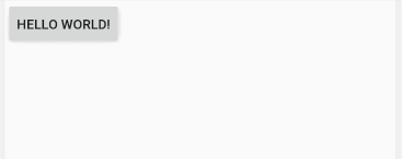
2.
match_parent : 자신의 부모(대개는 레이아웃)에 폭이나 높이를 맞춘다는 의미
    <Button
        android:layout_width="match_parent"
        android:layout_height="wrap_content"
        android:text="Hello World!" />
3.
background 속성은 위젯의 색상을 주로 #RRGGBB 값으로 지정
    <Button
        android:layout_width="match_parent"
        android:layout_height="wrap_content"
        android:background="#00ff00"
        android:text="Hello World!" />
4.
Padding은 위젯의 경계선으로부터 위젯 안의 요소가 떨어지도록 설정
android:orientation="vertical" // 위젯을 세로로 정렬 (horizontal이 default)
android:padding="30dp"
  <LinearLayout
        android:layout_width="wrap_content"
        android:layout_height="wrap_content"
        android:orientation="vertical"
        android:padding="30dp">

        <TextView
            android:layout_width="wrap_content"
            android:layout_height="wrap_content"
            android:text="***안드로이드 실습 예제***"></TextView>

        <Button
            android:layout_width="match_parent"
            android:layout_height="wrap_content"
            android:text="Hello World!" />

</LinearLayout>

5.
위젯과 위젯 사이에 여유를 두고 싶다면 layout_margin 속성을 사용
 <LinearLayout
        android:layout_width="wrap_content"
        android:layout_height="wrap_content"
        android:orientation="vertical">

        <TextView
            android:layout_width="wrap_content"
            android:layout_height="wrap_content"
            android:text="***안드로이드 실습 예제***"
            android:layout_margin="30dp"/>

        <Button
            android:layout_width="match_parent"
            android:layout_height="wrap_content"
            android:text="Hello World!"
            android:layout_margin="30dp"/>

</LinearLayout>
TextView

<*.xml 입력 예시>
 <LinearLayout
      xmlns:android="http://schemas.android.com/apk/res/android"
      android:layout_width="match_parent"
      android:layout_height="match_parent">
    <TextView
        android:id="@+id/text_view_id"
        android:layout_height="wrap_content"
        android:layout_width="wrap_content"
        android:text="@string/hello" />
 </LinearLayout>
<*.java 입력 예시 _ xml에서 할당한 id를 java 코드에서 접근 가능하게 만들기 >
 public class MainActivity extends Activity {

    protected void onCreate(Bundle savedInstanceState) {
         super.onCreate(savedInstanceState);
         setContentView(R.layout.activity_main);
         final TextView helloTextView = (TextView) findViewById(R.id.text_view_id);
         helloTextView.setText(R.string.user_greeting);
     }
 }
EditText

When you define an edit text widget, you must specify the R.styleable.TextView_inputType attribute. For example, for plain text input set inputType to "text":
 <EditText
     android:id="@+id/plain_text_input"
     android:layout_height="wrap_content"
     android:layout_width="match_parent"
     android:inputType="text"/>
< inputType 지정 가능 >
|
none 편집할 수 없는 문자열 |
phone 전화번호 |
|
Text 단순 문자열 |
datetime 날짜와 시간 |
|
textImeMultiLine 여러줄 입력 가능한 문자열 |
number 숫자 |
|
textPostalAddress 우편번호 |
numberSigned 숫자와 부호 |
|
textEmailAddress 이메일 주소 |
numberDecimal 숫자와 부호와 소수점 |
|
textPassword 비밀번호 |
textVisiblePassword 비밀번호 이지만 숫자는 보임. |
출처: https://caliou.tistory.com/33 [미녀개발자님의 블로그]
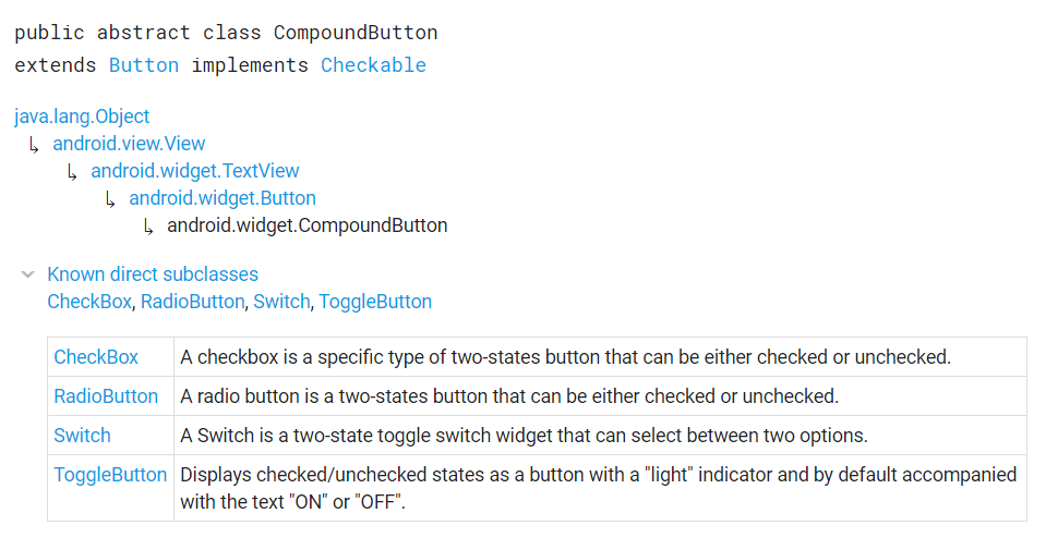
CompoundButton
체크박스, 라디오버튼, 스위치, 토글버튼의 상위 클래스인 CompundButton
CheckBox
<체크박스 체크 예시>
 public class MyActivity extends Activity {
     protected void onCreate(Bundle icicle) {
         super.onCreate(icicle);

         setContentView(R.layout.content_layout_id);

         final CheckBox checkBox = (CheckBox) findViewById(R.id.checkbox_id);
         if (checkBox.isChecked()) {
             checkBox.setChecked(false);
         }
     }
 }
RadioButton & RadioGroup
A radio button is a two-states button that can be either checked or unchecked. When the radio button is unchecked, the user can press or click it to check it. However, contrary to a CheckBox, a radio button cannot be unchecked by the user once checked.
Radio buttons are normally used together in a RadioGroup. When several radio buttons live inside a radio group, checking one radio button unchecks all the others.

Radio buttons allow the user to select one option from a set. You should use radio buttons for optional sets that are mutually exclusive if you think that the user needs to see all available options side-by-side. If it's not necessary to show all options side-by-side, use a spinner instead.
<라디오 버튼 예시>
<RadioGroup
        android:layout_width="match_parent"
        android:layout_height="wrap_content"
        android:orientation="vertical">
        <RadioButton android:id="@+id/radio_pirates"
            android:layout_width="wrap_content"
            android:layout_height="wrap_content"
            android:text="A"
            android:onClick="onRadioButtonClicked"/>
        <RadioButton android:id="@+id/radio_ninjas"
            android:layout_width="wrap_content"
            android:layout_height="wrap_content"
            android:text="B"
            android:onClick="onRadioButtonClicked"/>
    </RadioGroup>
public void onRadioButtonClicked(View view) {
    // Is the button now checked?
    boolean checked = ((RadioButton) view).isChecked();

    // Check which radio button was clicked
    switch(view.getId()) {
        case R.id.radio_pirates:
            if (checked)
                // Pirates are the best
            break;
        case R.id.radio_ninjas:
            if (checked)
                // Ninjas rule
            break;
    }
}
'OLD_달려라 > Android' 카테고리의 다른 글
| Flutter ] Android SDK 오류 해결방법 (0) | 2020.09.11 |
|---|---|
| Dart 언어 ] Future이란? (0) | 2020.09.10 |
| Flutter ] Flutter의 기본 개념 (0) | 2020.09.10 |
| Android 레이아웃 - View, ViewGroup, LinearLayout, TableLayout, RelativeLayout, FrameLayout, GridLayout (0) | 2020.01.02 |
| 안드로이드 개념 익히기 (0) | 2019.12.30 |


댓글